Two meanings of "8-bit" and "16-bit"
People use these words in two different ways, and mixing them up causes most of the confusion.
The first meaning is a game console generation. 8-bit consoles, like the Nintendo Entertainment System (NES) and the Sega Master System, had 8-bit processors. 16-bit consoles, like the Super Nintendo (SNES) and the Sega Genesis (Mega Drive), had 16-bit processors. "8-bit art" and "16-bit art" usually mean art that looks like the games of those machines.
The second meaning is color depth: how many bits store the color of one pixel. That decides how many different colors an image can contain, and it is what the Bit depth setting in our converters controls.
The two meanings don't line up. An NES game wasn't drawn in 8-bit color, and a 16-bit color image doesn't automatically look like a SNES game.
The console styles
| 8-bit era (NES) | 16-bit era (SNES) | |
|---|---|---|
| Screen resolution | 256 × 240 | Usually 256 × 224 |
| Colors | A fixed palette of about 54 distinct colors | 32,768 possible colors (15-bit), up to 256 on screen |
| Colors per sprite | 3 plus transparency | 15 plus transparency |
| Typical look | Bold outlines, flat areas, few shades | Smoother shading, gradients, more detail |
The limits shaped the look. With three colors per sprite, 8-bit characters are mostly outline, fill and one highlight, and backgrounds lean on tiles and patterns. With more colors per sprite, 16-bit artists could shade with several tones of one color, which is why 16-bit art looks rounder and softer.
The color depths
| Bit depth | Colors | How our converter stores them |
|---|---|---|
| 24-bit | About 16.7 million | Full color, nothing is reduced |
| 16-bit | 65,536 | RGB565: 5 bits red, 6 green, 5 blue |
| 8-bit | 256 | RGB332: 3 bits red, 3 green, 2 blue |
| 4-bit | 16 | A fixed set of 16 colors |
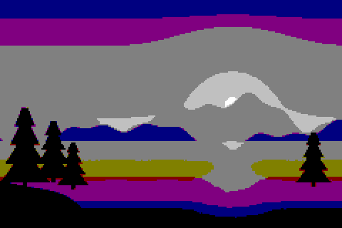
Each step down removes color levels. At 16-bit there are 32 levels of red and blue and 64 of green, which is enough that most photos look unchanged. At 8-bit there are only 8 levels of red and green and 4 of blue, so gradients turn into bands. The pixel art bit depth converter lets you switch between all four.
Original illustration
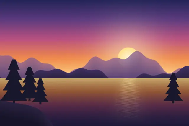
24-bit
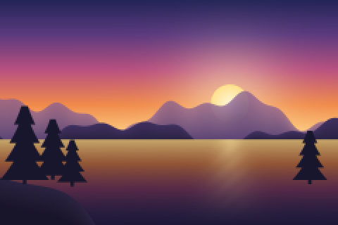
16-bit
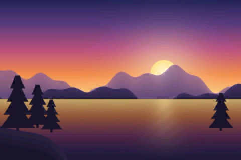
8-bit
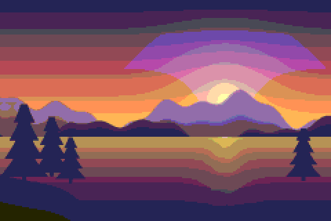
4-bit
Making the 8-bit look
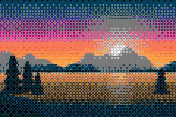
The color depth alone doesn't give you an NES feel. What does is a large pixel size, a small fixed palette and some dithering. The 8-bit photo converter starts with pixel size 8, the 41-color NES-style palette and Bayer 8×8 ordered dithering. For a stricter look, try the four-color Game Boy palette or PICO-8; the retro color palettes guide lists their colors.
Making the 16-bit look
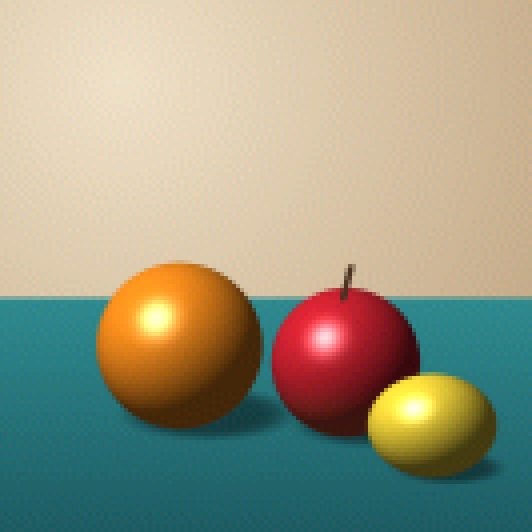
16-bit era art has finer pixels and more shades. The 16-bit art generator starts with pixel size 6, 16-bit color and Floyd-Steinberg dithering. Because 16-bit color keeps so many colors, most of the retro feel comes from the pixel size. If the result looks too much like a blurry photo, raise the pixel size or switch the palette to From the image with 32 to 64 colors, which gives flatter areas of color closer to hand-drawn sprites.
NES-style palette, Bayer 8×8
16-bit color, pixel size 6
Which one to choose
Choose the 8-bit style for a bold result that reads at a glance, such as an avatar or a game-jam sprite. Choose the 16-bit style when the image has faces, shading or detail you want to keep. If you are not sure, convert the same photo with both tools and compare the previews. Nothing is uploaded, so you can try as many settings as you like.